November Links
Forgotten Types, Drowned Types, Messages Hidden in Combs
Note: part of my process as a writer is to take lots and lots of little, blog-style notes, and patch them together later into longer essays and articles. For a while, over the summer, I tried pushing these out into the world through this site, but sending out unprepared, unaltered posts felt a little too exposed for me, so I quickly retreated. Still, a few of these are too good not to share, so going forward I’m going to commit to just sending out one of these a month. Unless otherwise stated, all photo credits are from the link itself.
What's so Roman about Times New Roman?
File this one under Things that bothered me inordinately as a child, when I was very picky about my fonts (this was the quickest way to show the world that I was a serious writer, you see). What makes a font Roman? Writing over at the excellent journal Antigone, Angharad Derbyshire has the story. Obviously, the original Latin alphabet of Rome is important, but this only gets you halfway there: the Romans only had capital letters and no punctuation marks or numeral signs, so that covers less than half of a typeface. Where did all the other symbols come from?
In Derbyshire's telling, the innovation comes around the peak of the Italian Renaissance, in the early to mid 15th century. As part of the general program to bring Italy's classical heritage back into fashion, scholars like Petrarch started elevating Roman fonts over the more common blackletter fonts that ruled for much of the Middle Ages. He encouraged his colleagues to use the "pure and clear" style known at the time as lettera antica—that is, antique letters. These were the kinds of fonts the humanists were finding in the really old books of Latin literature, so they assumed it was good, properly Roman stuff. The thing is, lettera antica is really what we call Carolingian Miniscule, which was created in monasteries around the time of Charlemagne. They weren't Roman at all, but pure Medieval, popular in Christian Europe before heavy, Gothic blackletter too over in the 13th century.
It's hard to overstate how terrible blackletter fonts are. They're hard to read, they waste huge amounts of ink, and Nazis use them. Wherever the new "humanist miniscule" of Roman capitals and Carolingian lower-case became popular, blackletter books pretty much disappeared. In England, this happened right around the 1580s, when Italian was all the rage. It's hard to understate how good this timing was: if the arrival of Roman fonts had been delayed by a few decades, first printings of Shakespeare and the King James Bible wouldn't be masterpieces of printing still legible and attractive today, but would rather look more like something tattooed on Hitler's left ass-cheek.
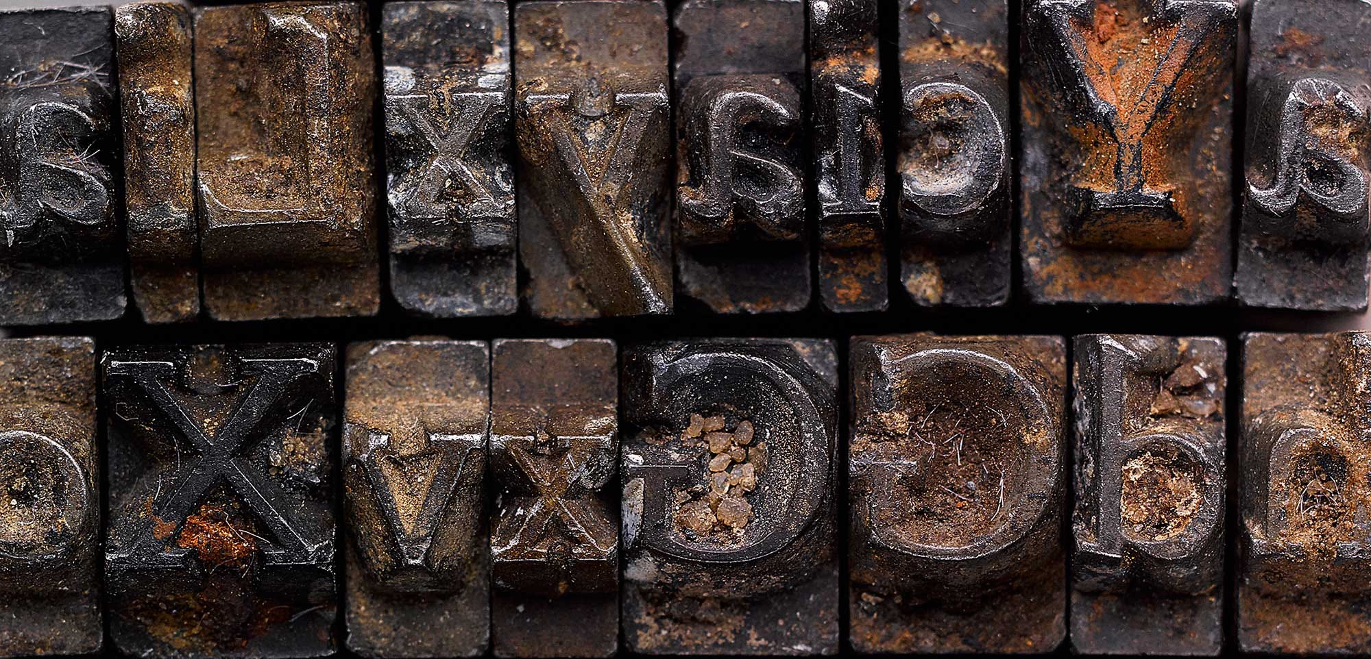
The Case of the Disappearing Doves Type
Speaking of fonts: the Doves Press of London might be the only publishing house more famous for its end than its beginning. It all has to do with their famous typeface. In only six years of operation, this private press financed by photographer Emery Walker and overseen by the Arts & Crafts maestroa T.J. Cobden-Sanderson put together some of the most astonishingly beautiful books and pamphlets in British history, chief among the Doves Press Bible. (A very quick online search suggests that you should be prepared to shell out at least $9,000 for your own copy, if not more). At the center of their operation was the Doves Type font, painstakingly made by Cobden-Sanderson and based on 15th century Venetian letter forms, like the ones mentioned above. They were austere, precise, and distinct: everything the preceding Arts & Crafts fonts championed by William Morris had not been. What we think of as Modernist book arts in the 1920s and 30s depend very much on Doves Type.

But as things often go in private presses, the lack of funds and ever-expanding pileup of deadlines led to a split between the partners in 1906. The Press languished for years, with Cobden-Smith refusing to allow anybody else to use "his" type. Finally, in 1913, well into his seventies, he took the radical step of hauling the punches and matrices of his types to Hammersmith Bridge on the Thames, and hurled them into the river. For for years, the elderly typographer kept making these grim pilgrimmages, hundreds in all, each time chucking heavy pieces of typographic equipment into the Thames. By 1917, he had finished "dedicating and consecrating" his life's work—all 2,000 pounds of it—to the depths.
I had heard this story before in books on typography. What I didn't know is that a few years ago, a British designer working on his own recreation of Doves Type fonts went ahead and hired a professional diving crew to dredge up 148 of these type-pieces, including most of its alphabet. They look like they're in pretty good shape, considering they spent 98 years under water! You can buy digital lecenses for New Doves Type here, at Robert Green's website.
A Human Monument
In 1966, English artist Tom Phillips emerged from a London bookshop with two things: a 3-pence copy of the forgotten author W.H. Mallock's Victorian doorstopper A Human Document, and a challenge from his friend to turn it into a work of art. Philips took the book apart and began to paint, draw, cut, paste, and collage over the book. The result was a strange hybrid of illuminated manuscript and trippy blackout poem, complete with its own story, the stream-of-conscious ramblings of a Mr Bill Toge. A few editions came out over the years, often wildly different from page to page. Many of the pages have been painted over or re-collaged a half-dozen times. The whole project went from being a bet with a friend to a kind of perverse challenge to see how many times, and in how many ways, one man could reform and recontextualize a shitty old novel. It was only in 2016, with the release of the sixth edition, that Phillips decided that A Humument was complete. He had been working on it for fifty years.

You can see more of it and read about it here, at The Outline, or on the artist's website. I first read about it earlier this month, in a TLS review of Phillips's new book, Humbert. All of it looks fantastic. I hope to explore Phillips's work more in this space at a later date, after I figure out an economical way to acquire his (expensive, large) books.

The Uyghur Internet is in Trouble
The ongoing, slow-motion ethnic cleansing of Uyghurs in China remains one of the most alarming human rights violations of our time, and I desperately hope you don't need a sarcastic book blogger to bring you up to speed on this. A little closer to my ambit, though, was this WIRED UK article looking at, as the title calls it, "The Strange Death of the Uyghur Internet." Just about every major Uyghur-language website in China has been either shut down directly by the government, forced out of business through red tape and financial pressure, or outright body-snatchered into spouting pro-Beijing bullshit to Uyghur readers. The Uyghur Human Rights Project has estimated that 80% of Uyghur-language sites have disappeared since 2009.
But even though the region was plagued by small-scale periodic internet blackouts, the Uyghur internet had grown vibrant. And for the Uyghur community, those websites were a place for both rediscovering Islamic religious practices and having conversations about hot-button issues such as homophobia, trans issues, and sexism. More importantly, the internet helped Uyghurs create an image of themselves different from the one offered by Chinese state media, says Rebecca Clothey, associate professor at Philadelphia’s Drexel University. “An online space in which they can talk about issues that are relevant to them gives them the ability to have a way of thinking about themselves as a unified mass,” she says. “Without that, they’re scattered.”
This is heartbreaking, and should sound a note of alarm for preservationists and historians everywhere. The internet can be a wonderful place to let our culture blossom, but it can also be ruthlessly disappeared.
Mass-Printing Classic American Literature
This one comes from Denise Gigante's forthcoming Book Madness: A Study of Book Collectors in America, by way of the great Lapham's Quarterly. The industrial revolution came a little more slowly to books, but when it did, the change was stark. Gigante writes:
New steam-powered rotary printing technology invented in New York in the mid-1840s revolutionized the print industry, rolling out thousands of pages per hour, while other innovations, such as stereotype printing, enabled a boom in cheap reading matter. By 1851 publisher George Palmer Putnam had begun stocking bookstalls at railway depots with paperback “Railway Classics,” light and entertaining reading for busy persons in transit. Mass-produced paper, machine-made from wood pulp rather than handmade from cotton, also stimulated growing networks of transcontinental and transatlantic correspondence.
The problem, as many bibliophiles at the time felt, was that far too much of the books now printed were crap. To improve the tastes of masses and put these new machines to good literary use, a pair of brothers, Evert and George Duyckinck of New York, decided to publish a series called The Library of Choice Reading. As Evert wrote in an advertisement, "so-called Cheap Literature, while it has failed to supply good and sound reading, and has been attended with many publishing defects, has in some degree prepared the way for the new demand. It has shown the extent of the reading public in the country and the policy of supplying that public with books at low prices.”
The Library series only ran for three years and surviving copies are worth no more than $50 on the secondhand market, so it's safe to assume that printing Hazlitt, Lamb, Goethe for the proles wasn't especially remunerative. Then again, when Allen Lane had pretty much the same idea in 1935, his dinky little startup turned into the mighty Penguin Books. And here in the states, the great Library of America is more or less continuing the mission that the Duyckinck brothers began. There's much more in Gigante's essay, and I've already added her book to the pile.
The Canaanite Comb
As I've written before in this space, it was very hard to learn Egyptian hieroglyphs or Sumerian cuneiform. Even establishing basic literacy in them required memorizing hundreds of glyphs and mastering an antiquated, literary dialect completely divorced from the spoken language. To Egypt and Sumeria's neighbors, writing was a great idea and seemed like a useful tool, but using hieroglyphs or cuneiform was just too much hassle. The writing systems were too bound up in their original languages. The Canaanites had an idea: why not just chuck 95% of the signs, keep a few dozen to make all the necessary sounds in the language, and write like that?

This happened some time between the 21st and 18th centuries BC, and is perhaps the significant development in writing after its invention: the Canaanites invented the alphabet. Not just an alphabet, mind you, but the alphabet. (OK, technically they had an abjad, but still.) The idea of just having a few dozen letters to make all the sounds you need has only been invented a few times, and most of those (I'm thinking of Japan and Korea) were from the Middle Ages. The Canaanites thought of it four thousand years ago, and from their Phoenician descendants we get Greek, Latin, Hebrew, and Arabic alphabets (and possibly India's Brahmic scripts, too), which means that almost the entire world today, except for a countries in East Asia, now use descendants of the alphabet that Canaan initially duct-taped together from old hieroglyphs.
This month, we have proof that this alphabet was already in widespread use as early as 1700 BC. A few years ago, a comb made of elephant tusk dating from around that time was found, with tiny inscriptions in Canaanite. The comb is tiny, at 3.5 by 2.5 centimeters, and the 17 letters are nearly faded beyond recognition. But thanks to the heroic labors of researchers at Hebrew University of Jerusalem and Tennesee's Southern Adventist University, a translation of the comb's inscription is now available. It's not the absolute earliest known use of the Canaanite alphabet, but it's easily the oldest interesting thing, as most inscriptions are just names and titles. As one of the translators explains:
“This is the first sentence ever found in the Canaanite language in Israel. There are Canaanites in Ugarit in Syria, but they write in a different script, not the alphabet that is used till today. The Canaanite cities are mentioned in Egyptian documents, the Amarna letters that were written in Akkadian, and in the Hebrew Bible. The comb inscription is direct evidence for the use of the alphabet in daily activities some 3700 years ago. This is a landmark in the history of the human ability to write,”
That landmark reads, in its English translation: “May this tusk root out the lice of the hair and the beard.”
Paleography at its finest.
.")
10,000 Words a Day, or a Novel Every Year?
In 1969, a young med student at Harvard Medical School approached the dean with a confession and a deal: he didn't want to be a physician anymore, but wanted to use his training to write books (fiction and nonfiction) about medical science. The dean, who knew a thing or two about these matters, told the student that writing a book isn't such an easy thing to do. Cal Newport has the punchline:
It was at this point that the young medical student revealed that he had already published four books while at Harvard (under a pen name), and had multiple other writing projects in progress, including his first medical thriller, A Case of Need, that would soon win him an Edgar Award for best mystery novel of the year, and his first fully-developed techno-thriller, The Andromeda Strain, which would become a breakout bestseller.
Yes, it was Michael Crichton, who at 26 years old was already wildly prolific. Within two years, he was on the best-seller list, working on several novels (under his own name and a pseudonym), writing film scripts, and taking crash courses in Hollywood schmoozing to make sure Tinseltown knew his name and bought the rights to his books. Crichton was a writing machine, supposedly churning out 10,000 words a day, every day. You can read more about his work habits here.
Newport, a productivity blogger, contrasts Crichton with John Grisham. Obviously, Grisham is also hyper-prolific compared to most novelists, but channels his work in a very different way, focusing on only one project at a time and publishing one book per year. He starts a first draft in January, finishes it around March, and has it done by the end of the summer.
Newport sees two models of creative production here:
In Crichton and Grisham we see two different models of ambition. The first model, exemplified by Crichton, is what I call Type 1. It craves activity and feasts at the buffet of appealing opportunities that success creates. The other model, exemplified by Grisham, is what I call Type 2. It craves simplicity and autonomy, and sees success as a source of leverage to reduce stressful obligations.
Tag yourself! I’m a Type 2.
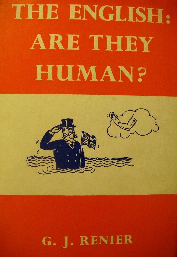
I leave you now with this spectacular book cover, found earlier this month in The Times Literary Supplement among several other gems. Happy reading, and watch out for the English!